Caocao Driver Scheduled Trips Pool
Overview
Caocao is a leading rideshare service in China, comparable to Uber and Lyft in the US, that primarily employs full-time drivers.
I led the redesign of the driver's scheduled trip feature to improve the trip-accepting experience and increase platform revenue.
Drivers can only passively receive scheduled trips, missing many opportunities to receive more trips.
Research
Data analysis
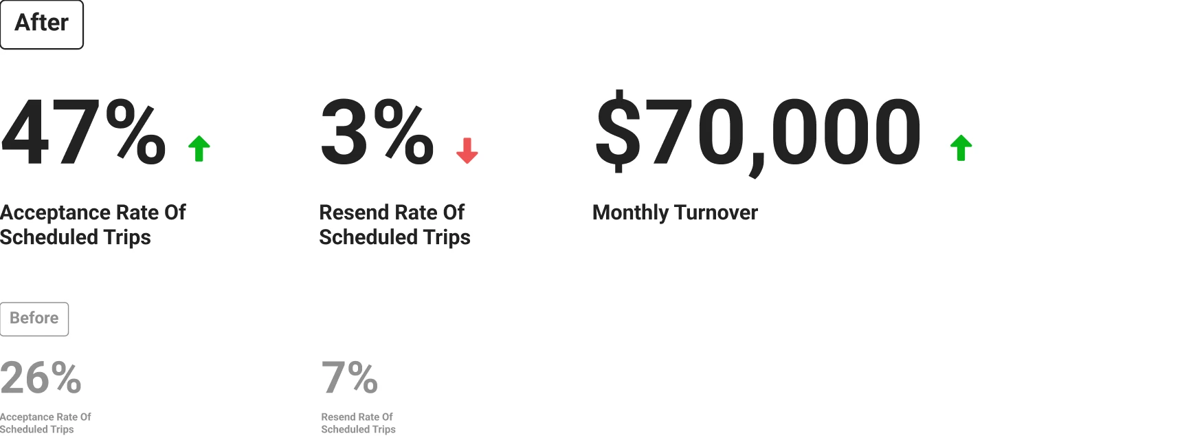
I worked with the data analytics team, got the data: acceptance rate of scheduled trips was just 26%.
It means that many trips were lost, which can affect riders' experience and drivers' salaries. We wanted to improve this data.
User interview
I conducted a user interview with one UI designer. From 16 drivers, we learned that drivers wanted more flexibility, and the current experience had real problems.
Proposed solution
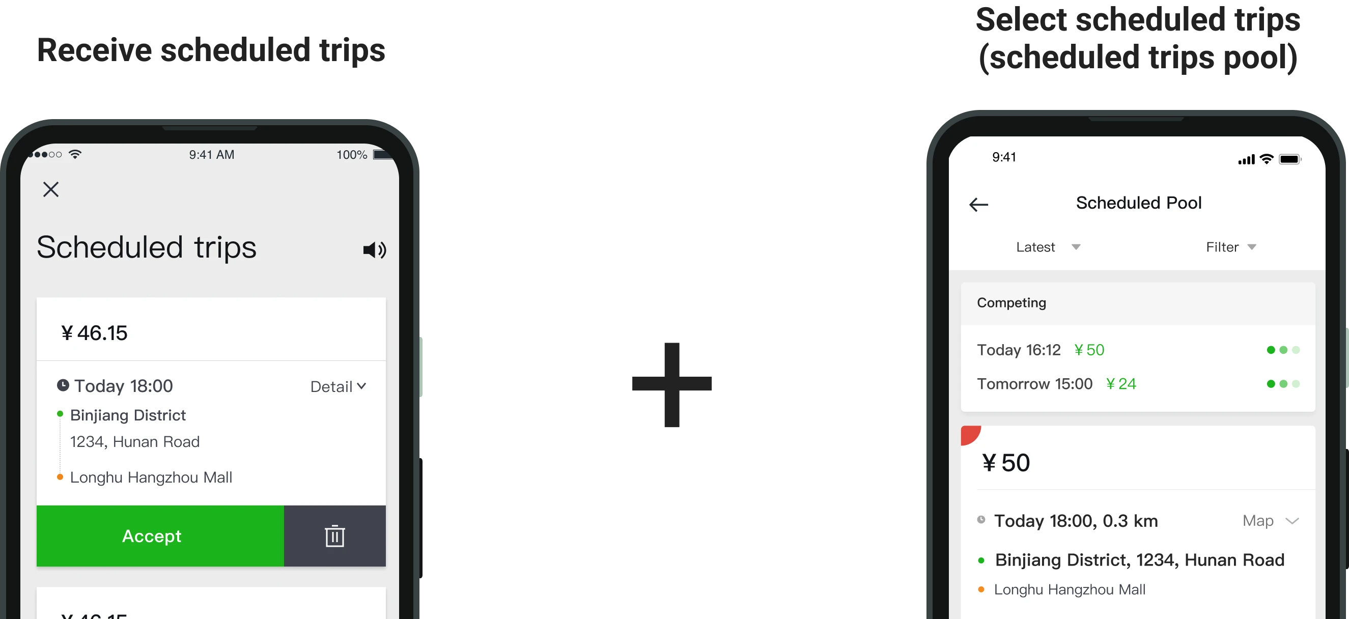
Retaining the current dispatch strategy, I introduced driver choice in selecting city-wide scheduled trips.
Project goals
- 01Increase turnover of the Caocao platform
- 02Increase acceptance rate of scheduled trips
- 03Resolve users' problems with the current design
Design challenges
After an in-depth understanding of the product requirement, combined with the previous user research, I found that there were two parts I need to put more efforts to design: solving the original experience problems of the scheduled trips feature and making the process of accepting the new trip smooth. Specifically.
- Reduce driver mishandling when accepting trips
- Make the process of accepting trips intuitive
Challenge 1
Reduce driver mishandling when accepting trips
Problem
Drivers face challenges accurately accepting a specific scheduled trip when many trips come in at once, leading to accidental acceptance of the wrong one — which costs them money or adds stress.
Related data
Resend rate of scheduled trips is 7%.
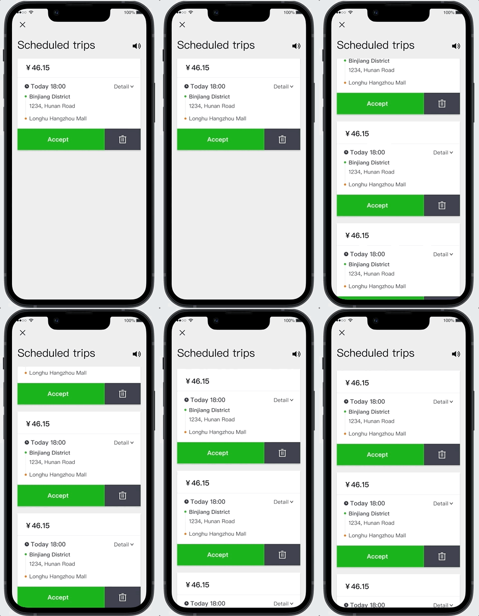
Current design
Ideation
I started brainstorming and conducted competitor analysis to generate multiple design ideas.
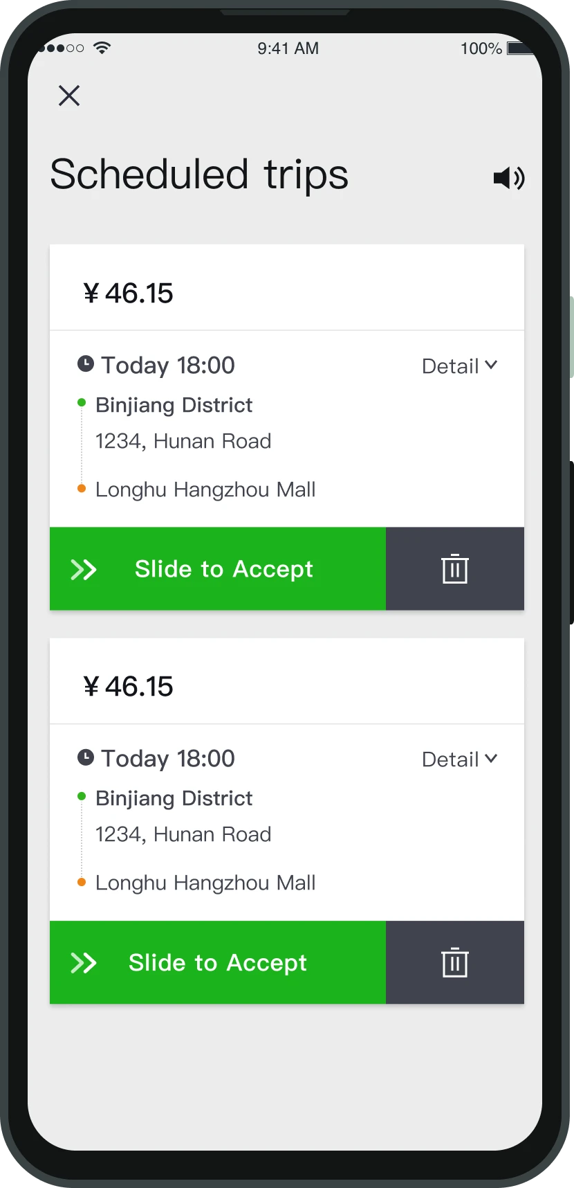
1. Change from click to slide
Longer action time allows drivers to realize and avoid mis-clicking release button.
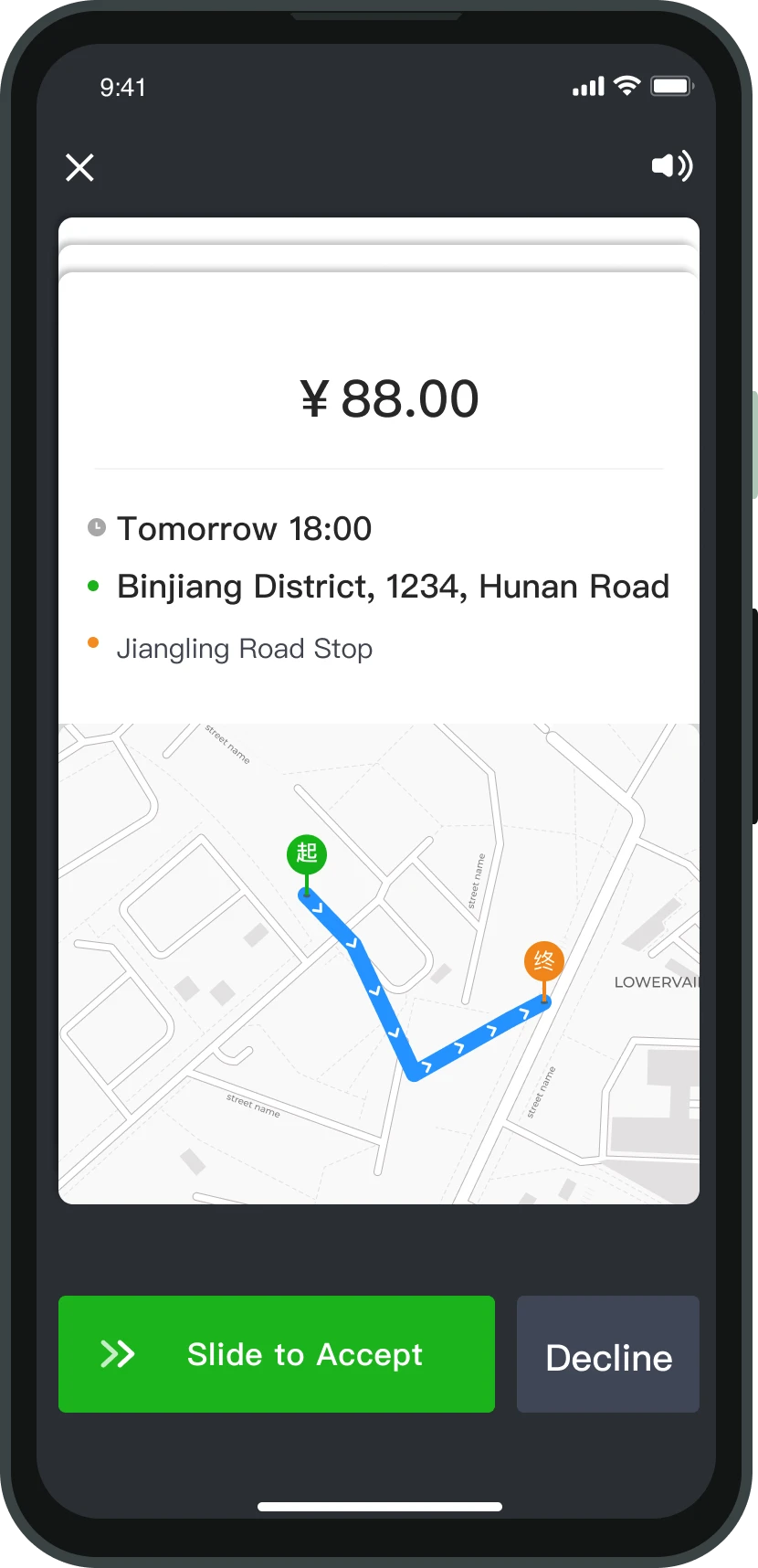
2. Display one trip at a time
With additional trips shown behind the current one, drivers can swipe to view and decline the next trip.
Design critique
I conducted a design critique session with PMs and other designers, and I learned:
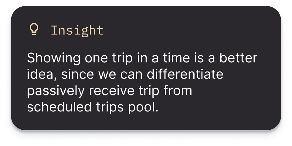
Final design
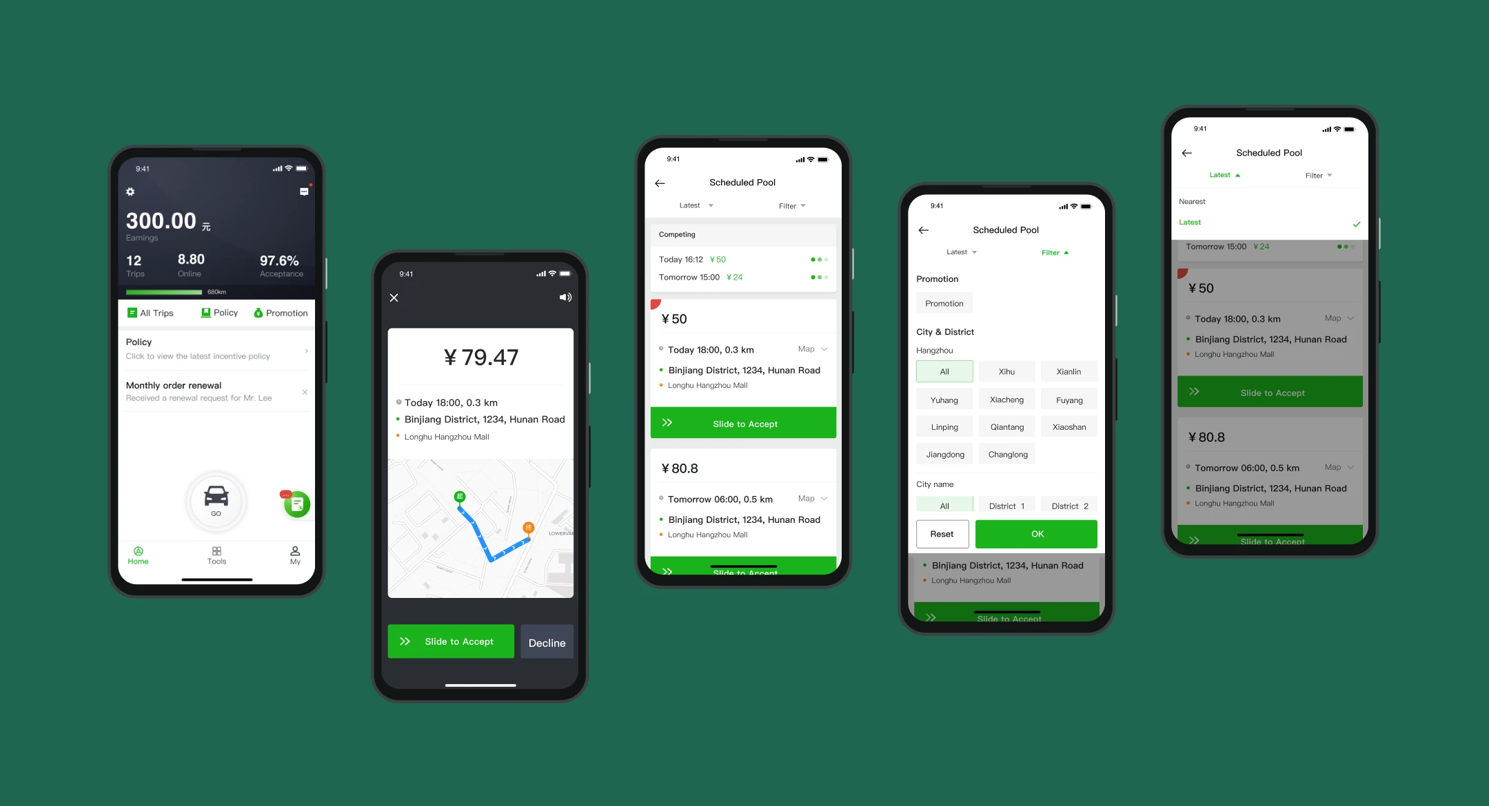
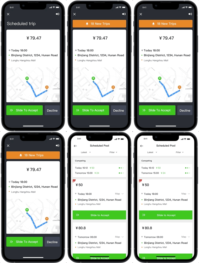
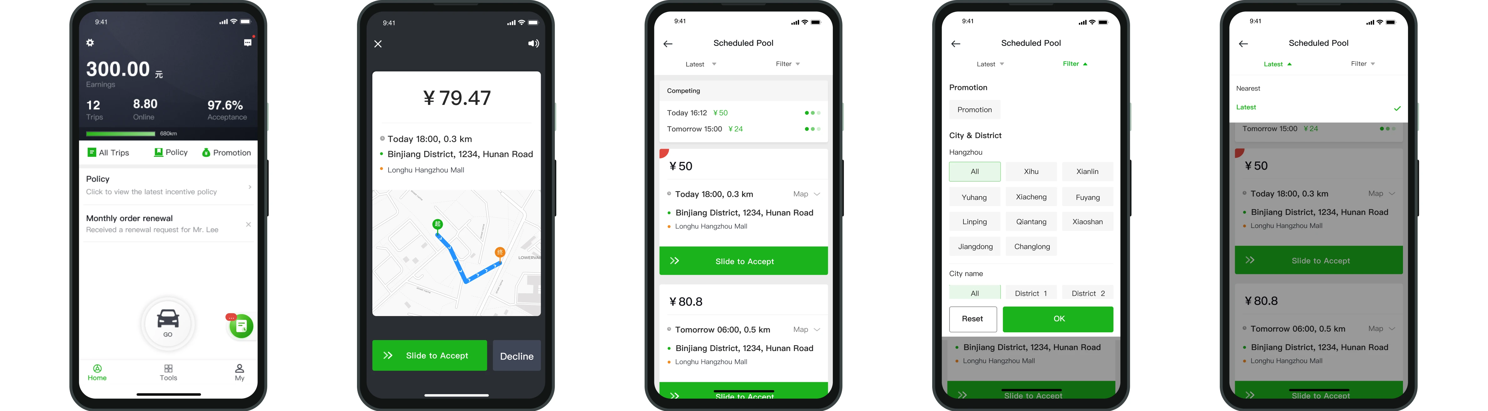
The improved design displays one trip at a time, with a notification for incoming trips. Drivers can open the notification to access the scheduled pool and select additional trips, streamlining the process.
Challenge 2
Make the process of accepting trips intuitive
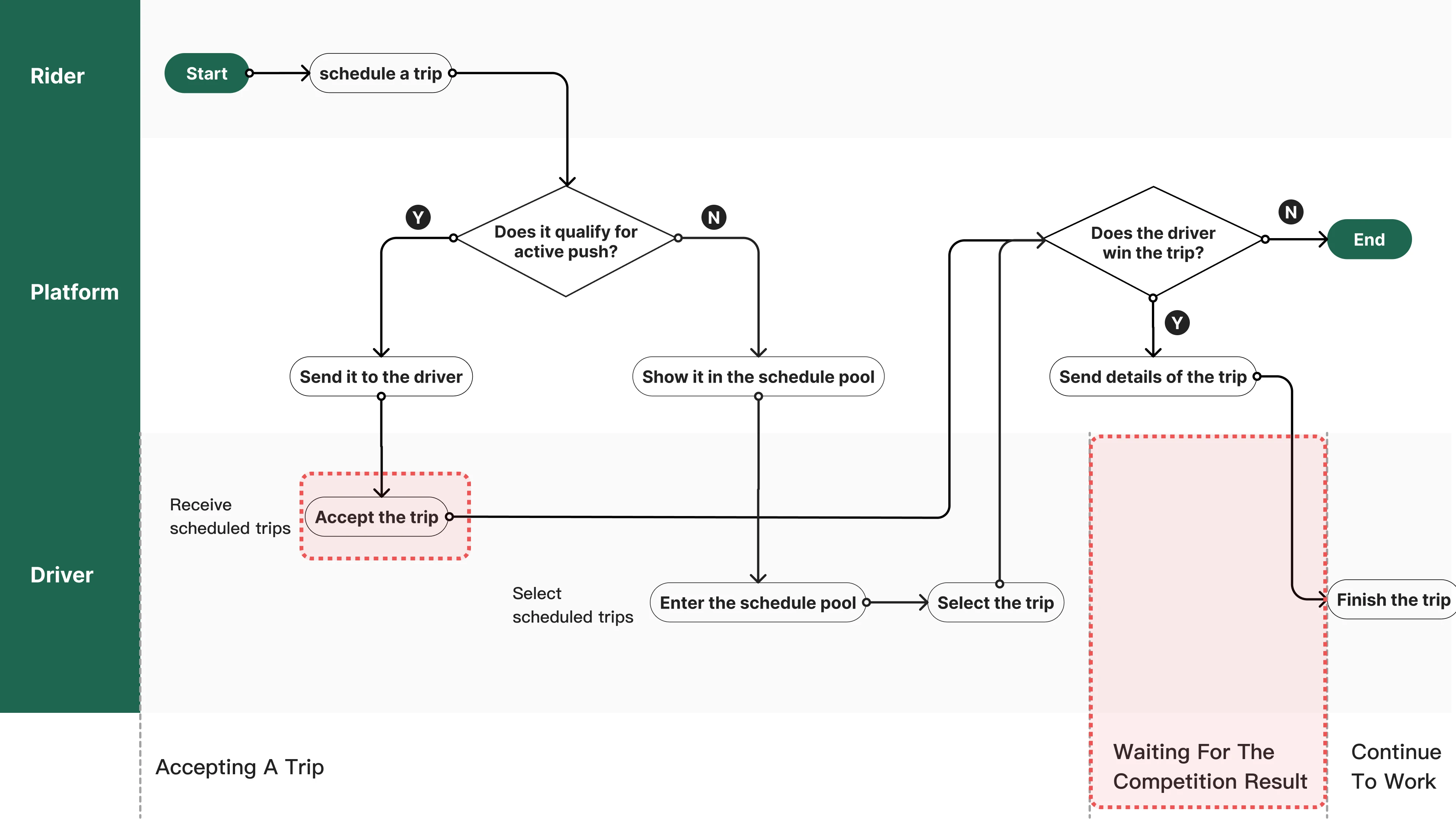
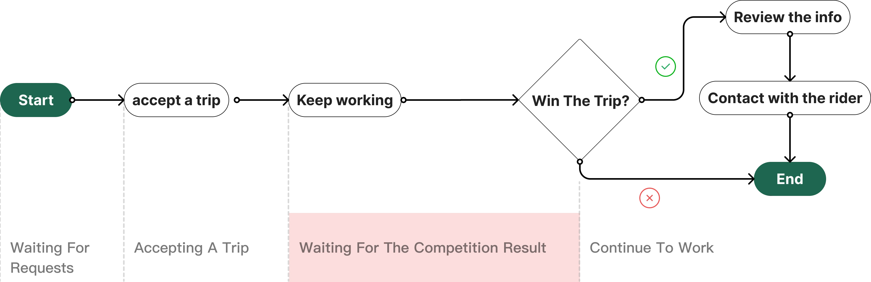
After a driver selects a trip, it isn't confirmed right away — other drivers may be competing for the same trip, and the platform assigns it to whichever driver fits best, creating a waiting period. The current design doesn't make this waiting status clear to drivers, so I wanted to make it more intuitive.
Ideations
These were the two most solid solutions among multiple ideas at that time.
Enter the scheduled pool
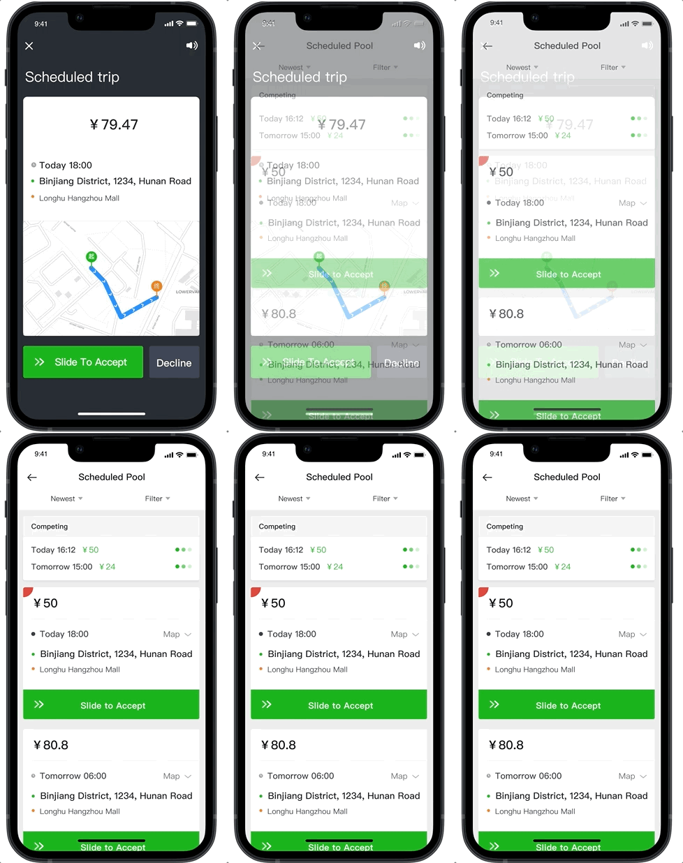
After accepting the trip, the page changes to the scheduled pool page, where drivers can see the competition status.
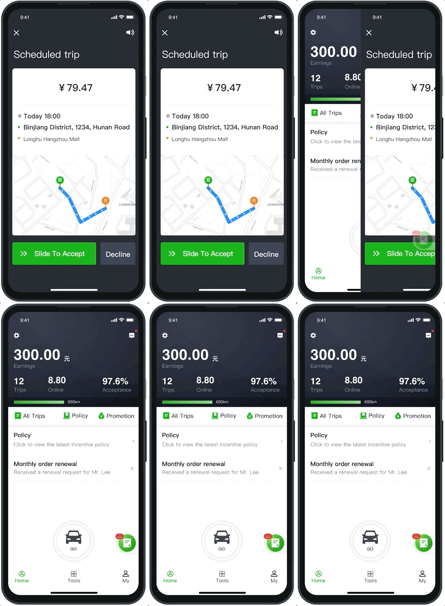
Back to work + status badge
After accepting the trip, the page returns to the previous screen and shows an icon with a status badge, letting drivers continue their work.
User testing
I collaborated with another designer on user testing, testing 6 drivers through a high-fidelity prototype — since the team couldn't reach consensus on the best solution between the two ideas above, user testing was crucial in determining the final design.
Final design
Impact
Comparing the data of 4 months before and after the project launch, we get the following results.