Laudspeaker is a dynamic marketing automation platform enabling users to effortlessly design and automate messaging journeys through a user-friendly drag-and-drop interface.
Despite attracting new users, we faced a low conversion rate. As lead designer, I revamped the core feature, the Journey Builder, to elevate user experience and drive conversions.
UX Design
UI Design
User Research
1 x product manager
2 x engineer
03/2023 - 05/2023
To find why users were leaving during the trial, I studied journey creation sessions and conducted a heuristic evaluation.
I analyze diverse feedback sources to create visual user journey maps, revealing insights during product trials.
I analyzed 16 screen recordings in PostHog's backend, pinpointing user challenges during journey creation.
Collaborating with the product manager, I hosted a heuristic evaluation, identifying issues from a more expert standpoint.
Setting up a component took up to 7 manual steps.
Users lacked guidance for next steps.
Confusion within the journey map and setting forms.
Reduce journey creation steps for improved usability.
Include suitable hints to enhance user confidence during trials.
Enhance navigation and comprehension for journey maps and setting forms.
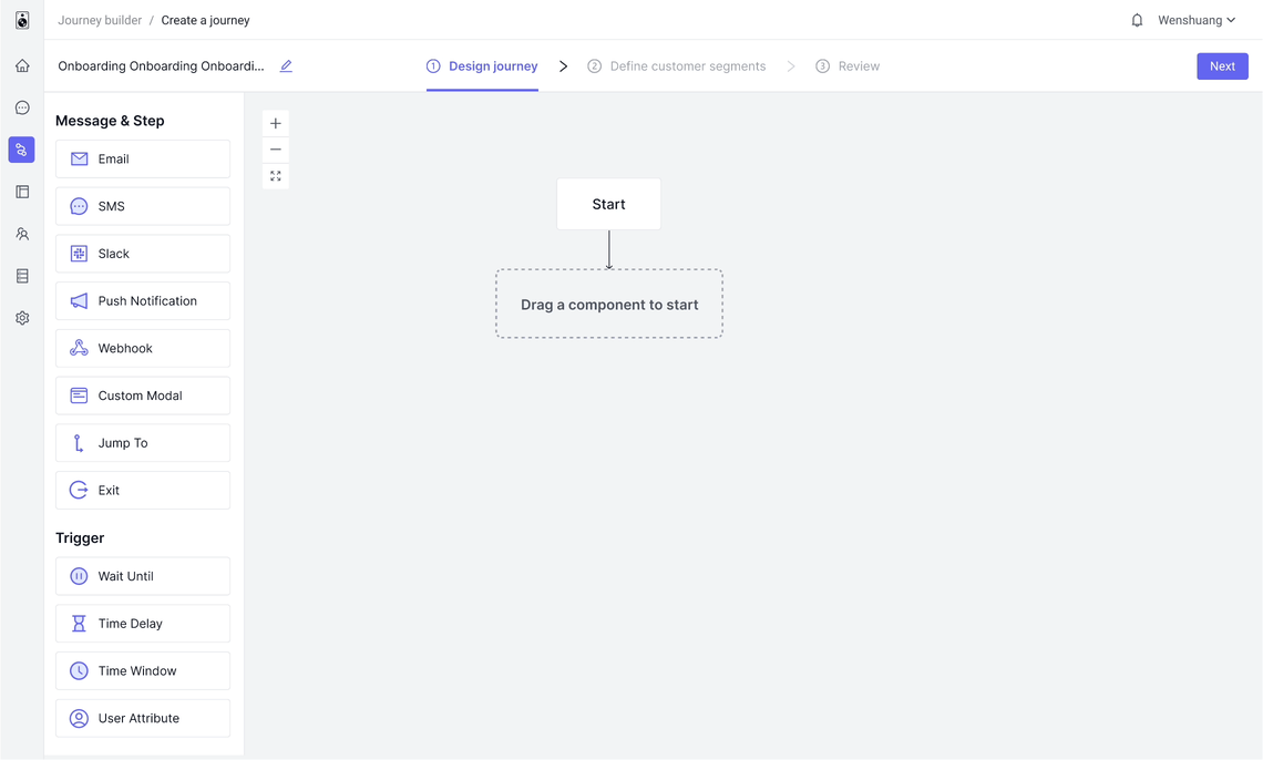
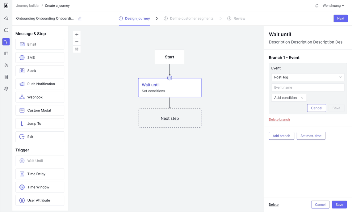
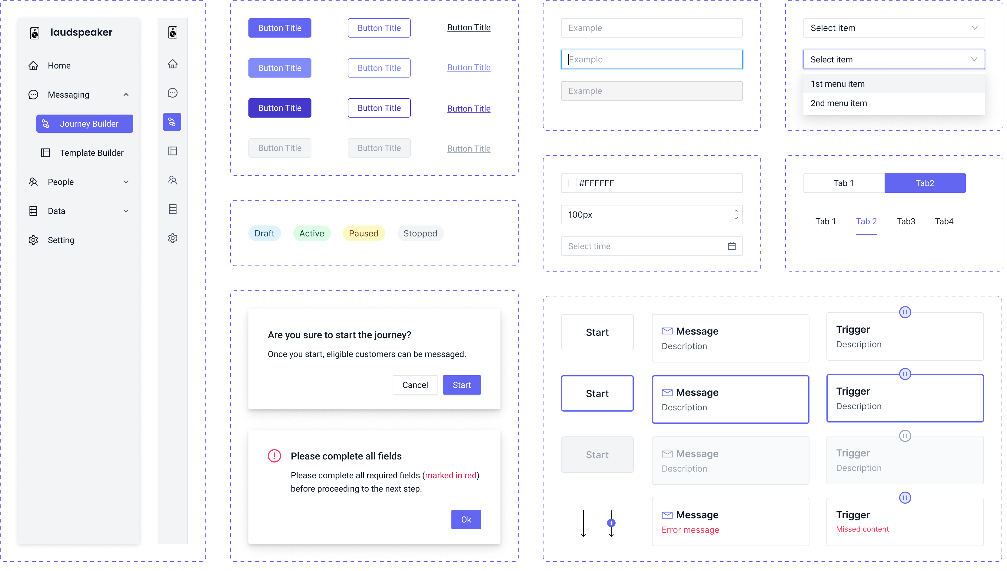
I began with an initial framework to maintain consistent page layouts during journey creation. This ensured uniform user experiences and minimized confusion, covering button placement and interactions.
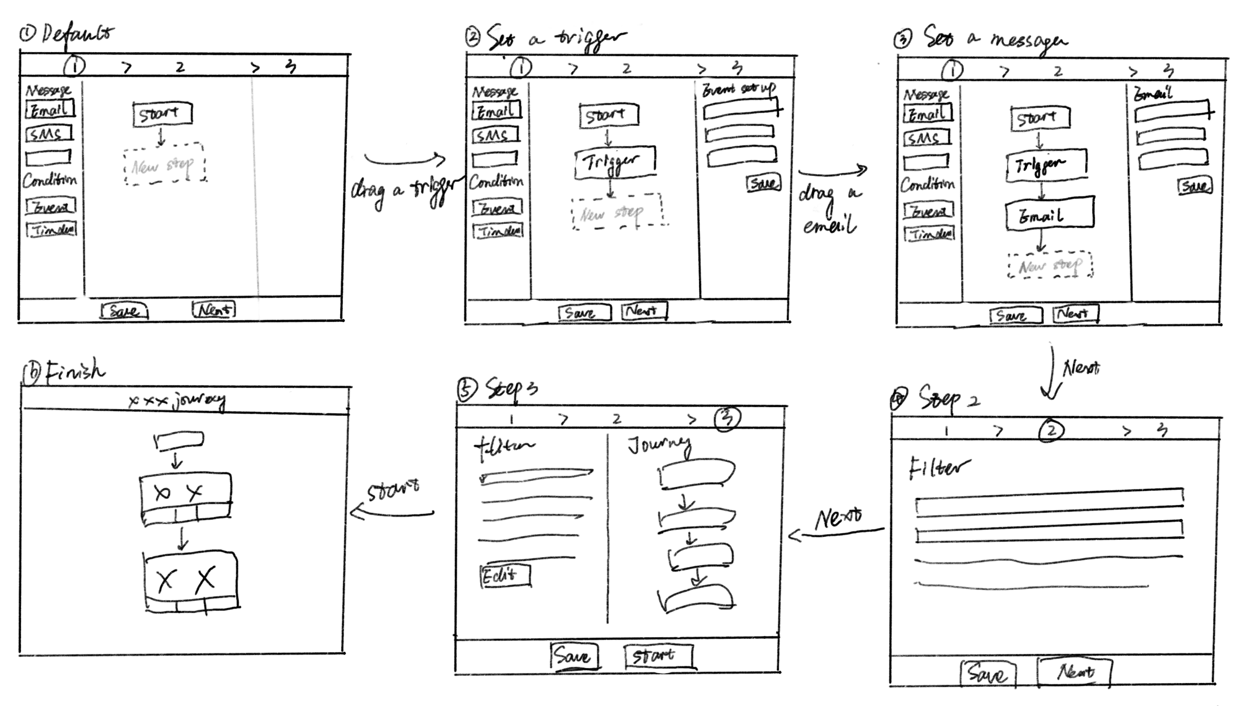
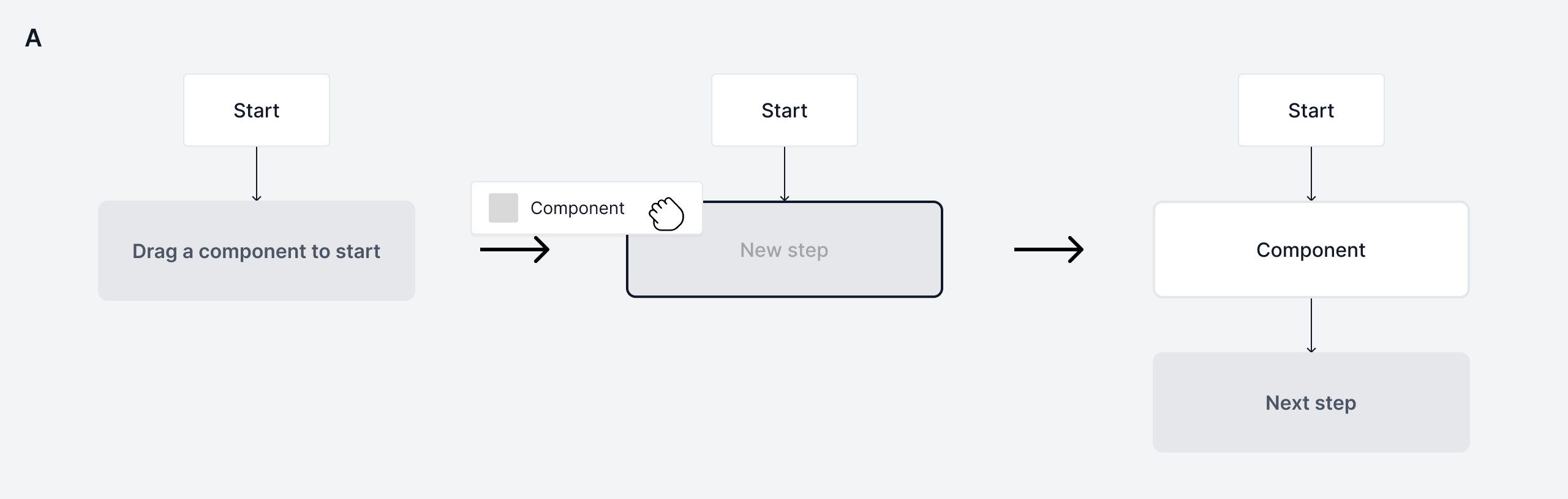
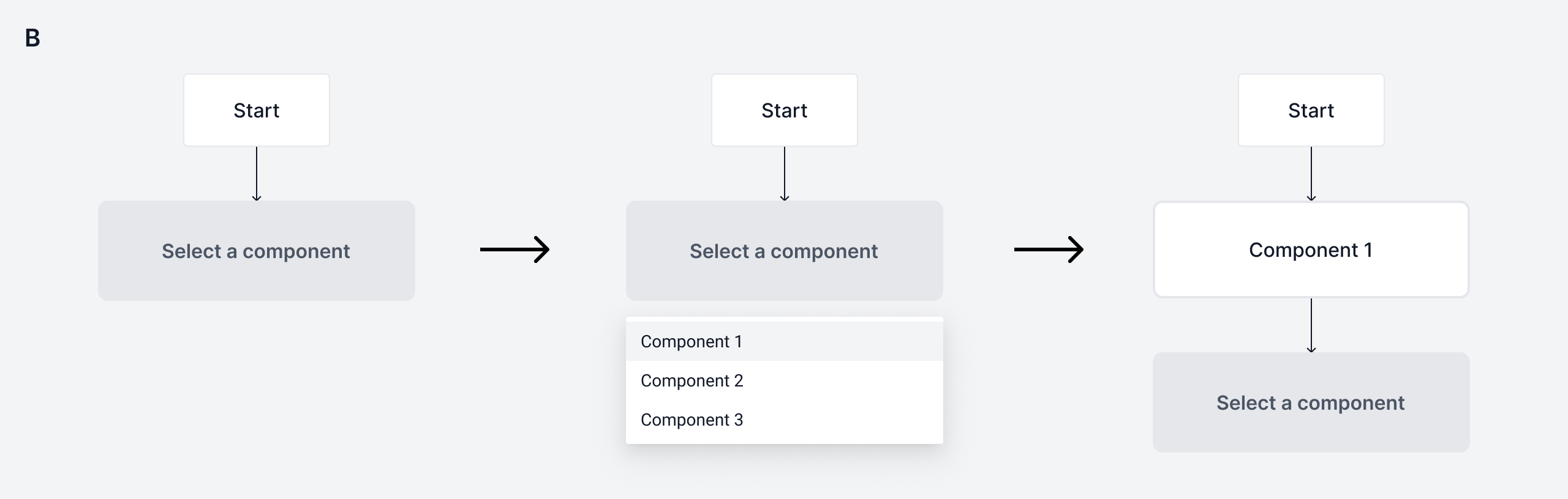
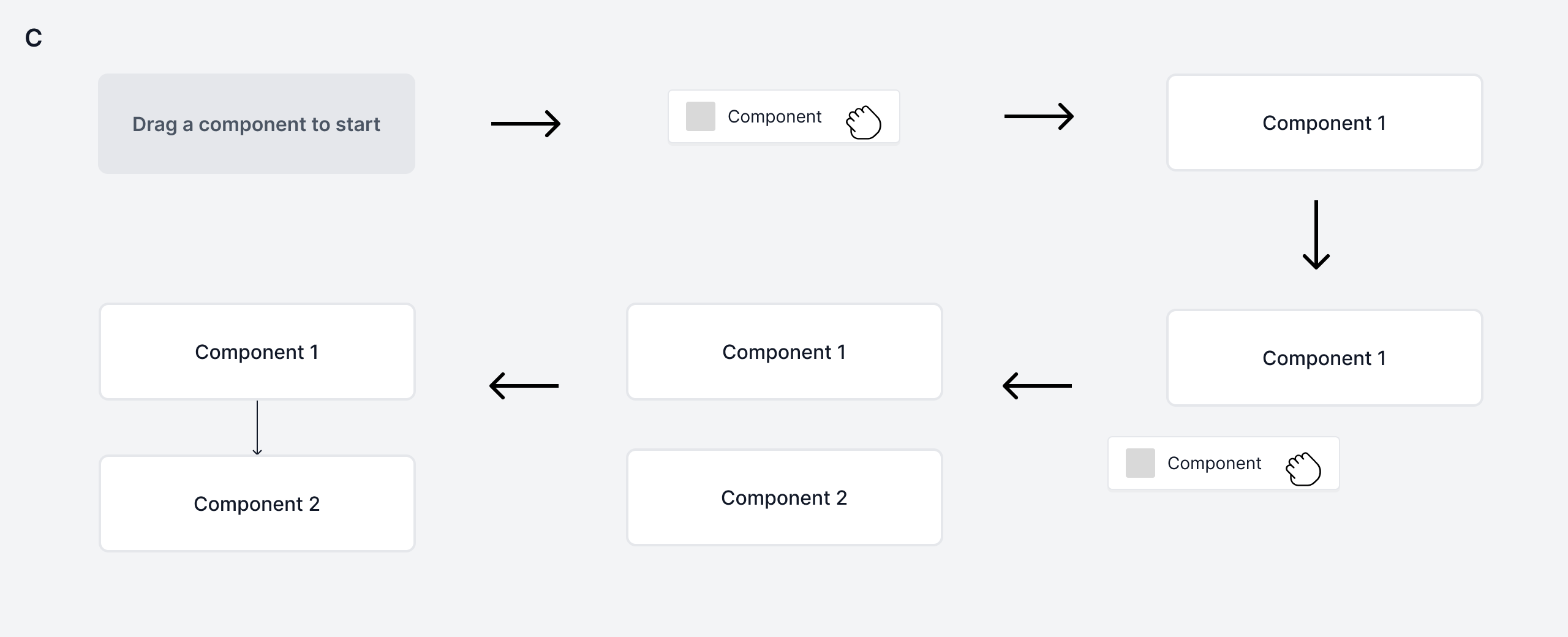
Next, I explored different ideas on adding a component. As this action repeats for multiple components, I aimed to minimize steps.
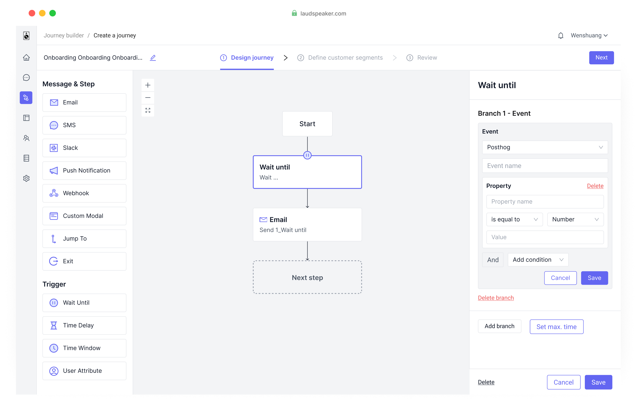
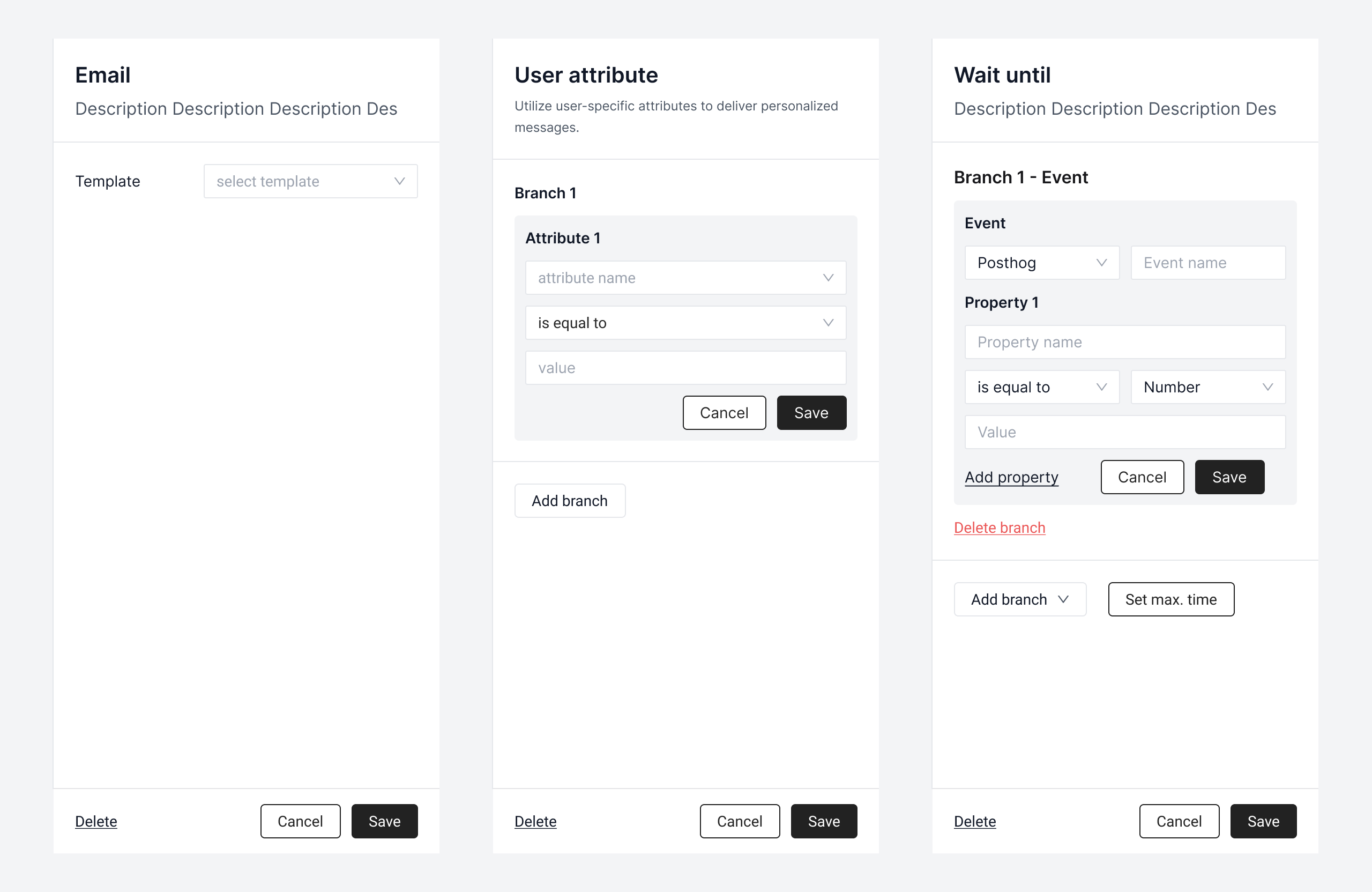
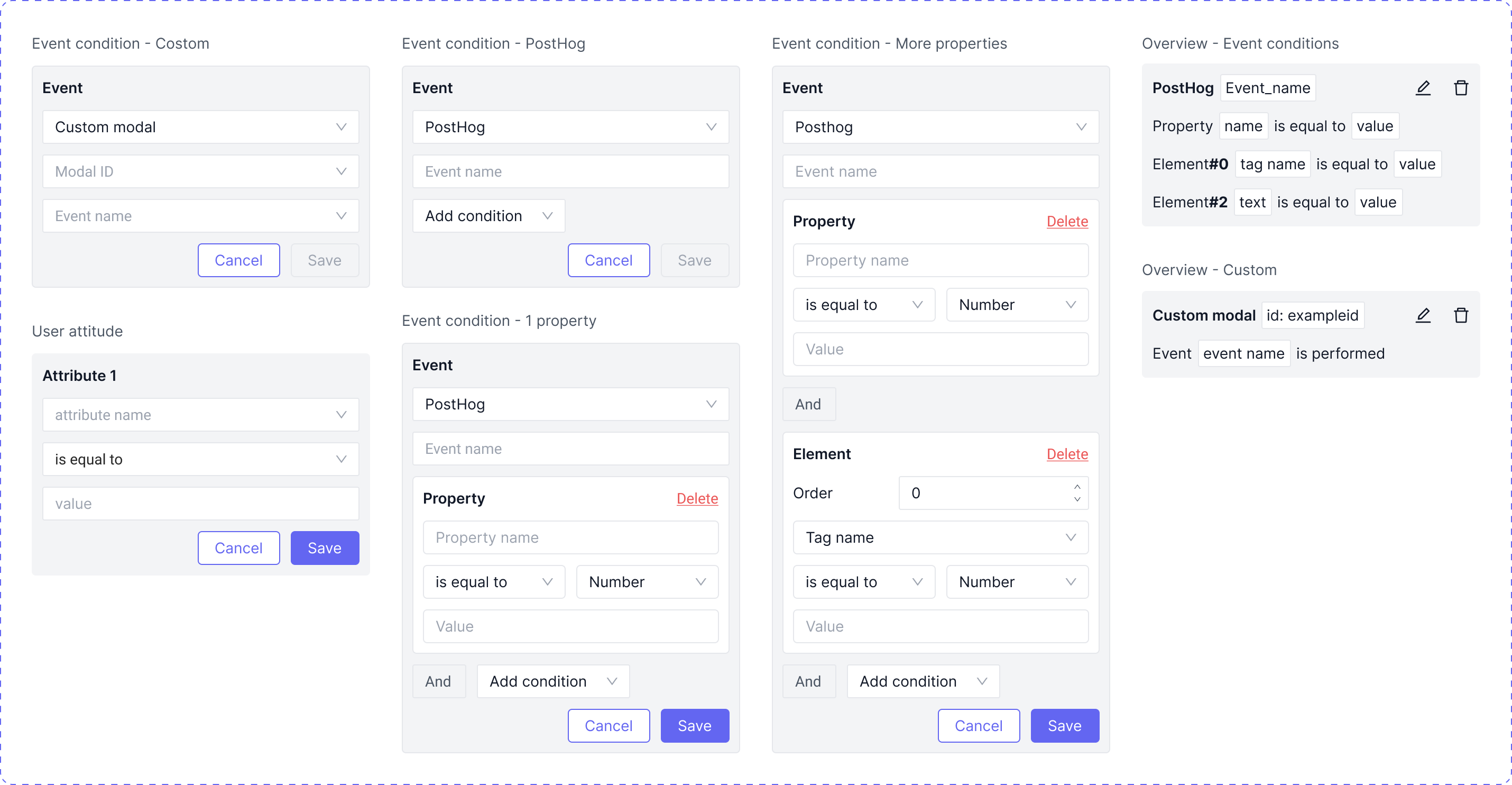
Lastly, I tackled detailed settings for each component. Considering diverse settings, I emphasized uniformity, scalability, and readability in design decisions.
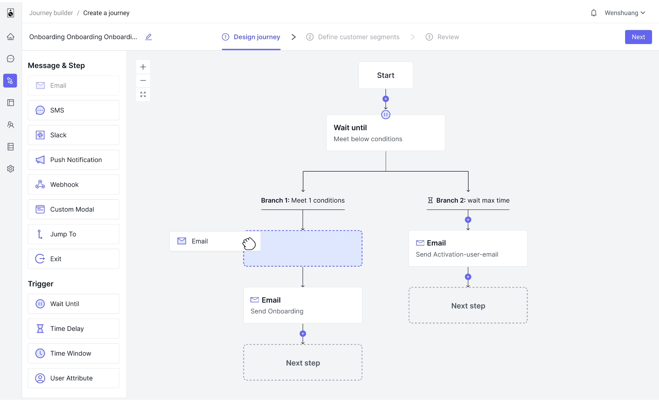
Creating a component now takes only 3 steps: drag > drop > set, reduced from previous 7 steps.
Ample visual hints guide users seamlessly through each step.
Modularizing complex configuration forms for easy reading, while fostering user familiarity with layouts.
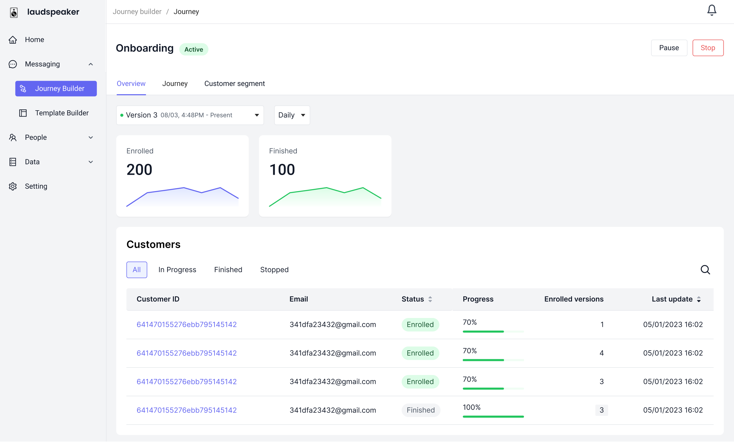
Visualizing Journey data aids users in quickly grasping Journey performance and making informed decisions
Recorded sessions showed users could now adeptly create journeys on their own.